Rapid Results Branding (case study)
Rapid Results is a medical technology company that designed a mass rapid testing device in response to the COVID-19 pandemic.
This project was developed for a Design Lab course during my Masters in Design studies.
The brief for this project was to design a brand and app to support mass testing needs during the COVID-19 pandemic. The name Rapid Results was chosen as a straightforward and descriptive name of the brand.
Development of the visual identity focused on projecting a feeling of ease and practicality.
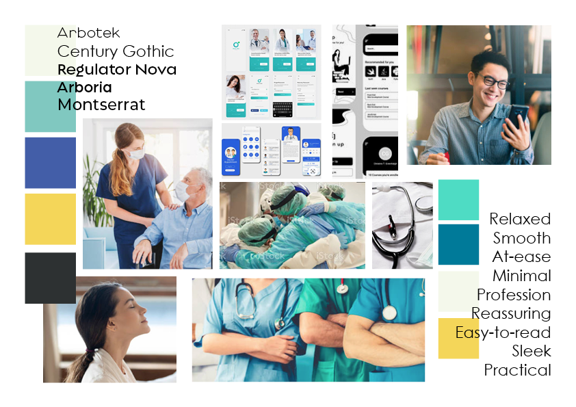
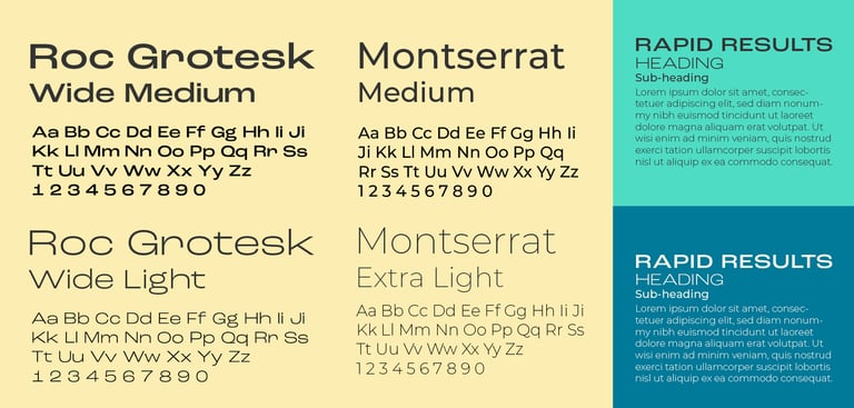
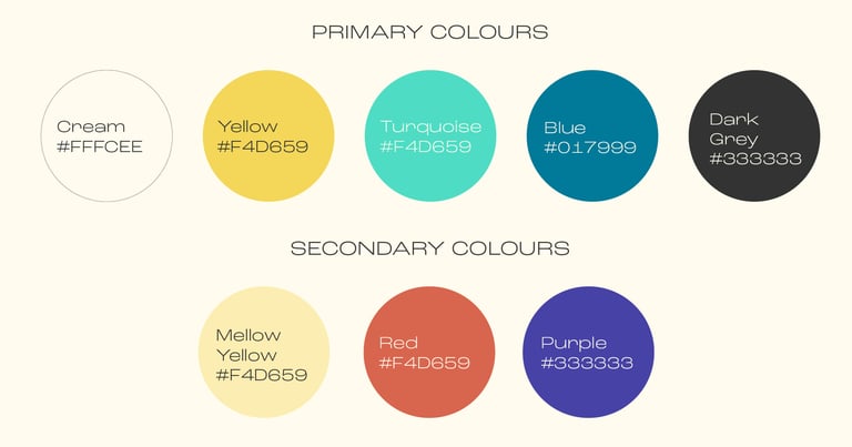
Branding mood board. Fonts chosen were soft and easy to use, while the colours were calm and friendly.
Early sketches for the logo explored the use of the letter R as the key visual element. Playing around with combining the letter R with a clock or stopwatch produced the early sketches of the final form of the logo.
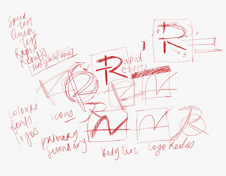
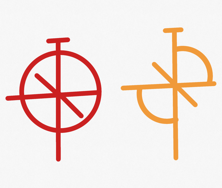
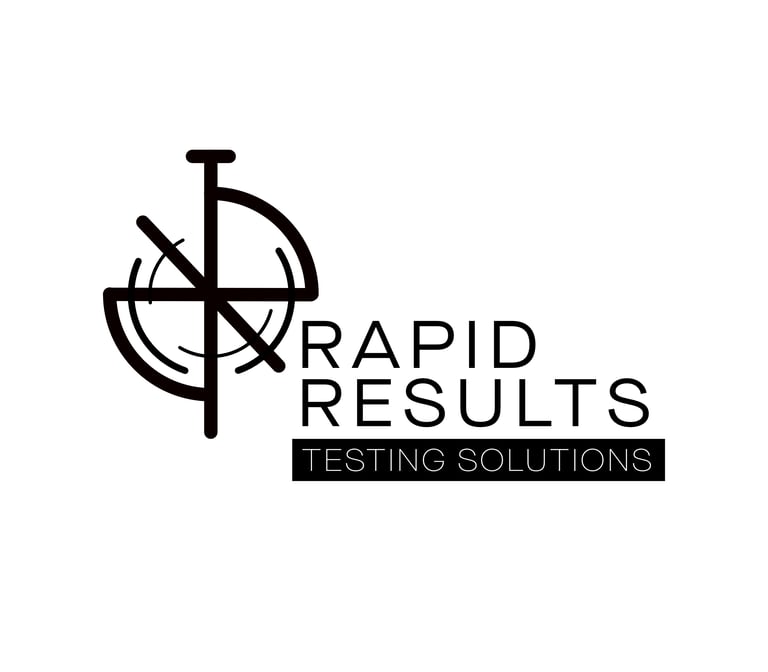
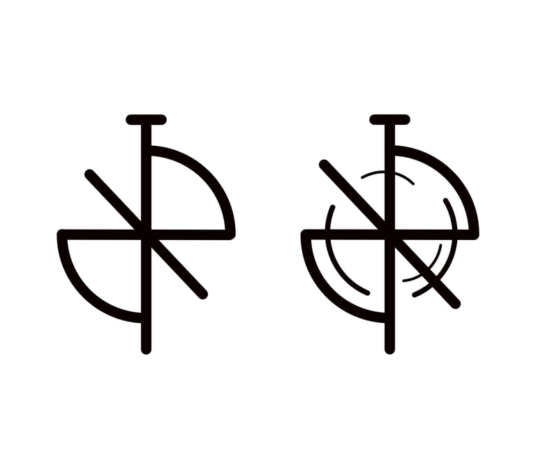
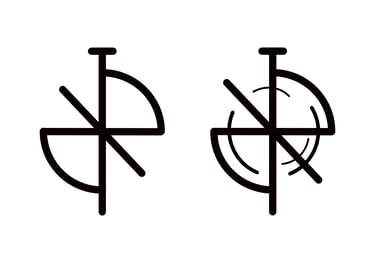
The first version of the logo stayed close to the initial sketches as shown above, using rounded line ends to keep the whole logo feeling soft. I also added in the accent lines to add movement and a sense of rapidity to the visual.
In this version I felt the R shapes got lost in the design and the logo was too elongated. The rounded corners also didn't give the brand a strong enough presence. These were critiques that I took into account in the final refinement of the logo.
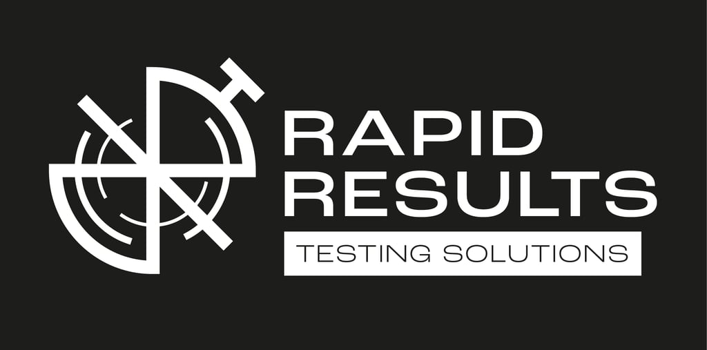
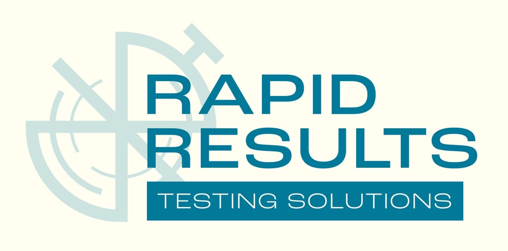
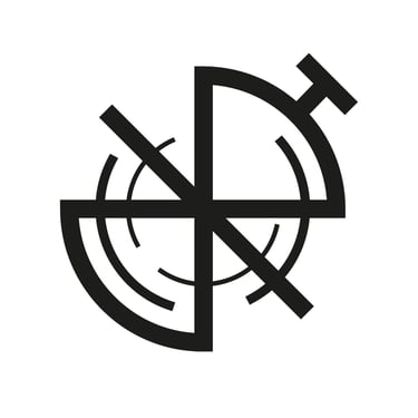
In the final logo, the stopwatch button was moved to the side to better resemble what is symbolises. The elongated lines from the top and bottom of the logo were removed and thicker, straight ended lines were used. In this iteration, the two Rs can be better seen and even bring out an hourglass shape which adds to the theme of speed and time efficiency.
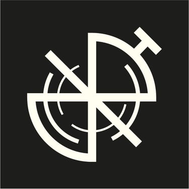
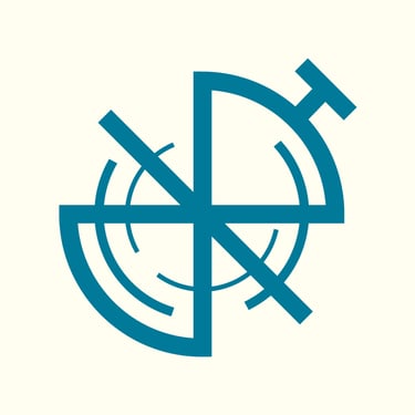
The final branding also looked at colours, fonts, and illustrated accent elements.
