be/longing logo
be/longing is a community arts-for-education lab in Hong Kong catering the ethnically-diverse communities of the city.
be/longing uses storytelling to explore experiences of being, longing, and belonging among Hong Kong's ethnically-diverse communities. Through arts education and other creative workshops and experiences, they offer marginialised voices a platform to be heard and build inclusive communities that they can comfortably and happily be a part of.
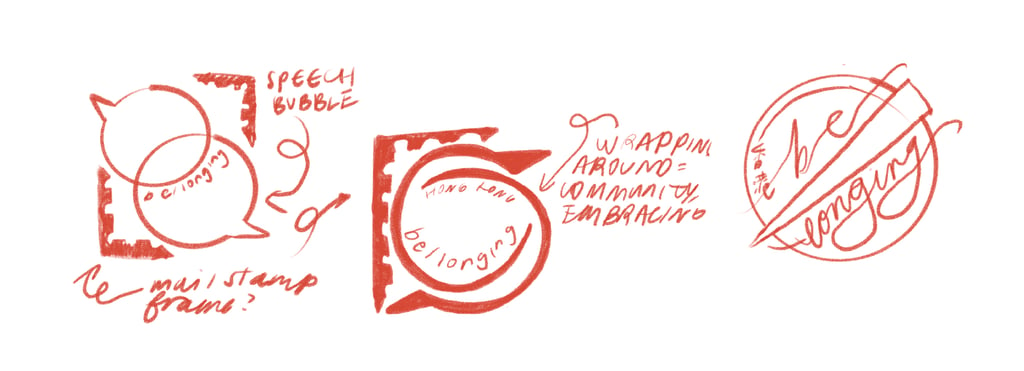
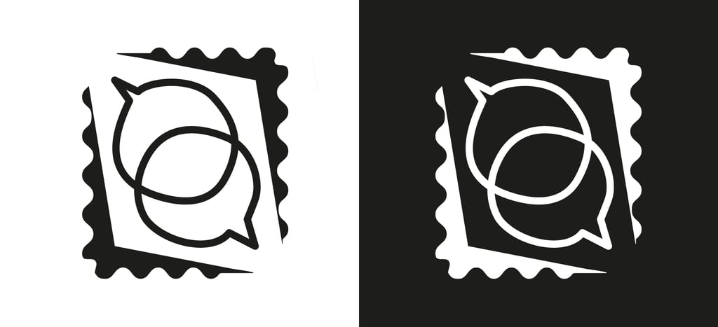
Two key concepts had to be captured in the logo: belonging and dialogue. Along these lines, early concepts for the logo explored the use of mail stamps to symbolise being from or belonging to a place. Speech bubbles were used to represent the conversations between communities and peoples that is at the heart of be/longing's mission.
Moving forward with the first concept shown above, the form of the logo was solidified. Instead of using a frame of even thickness, I created a frame that was more dynamic within which to house the speech bubbles.
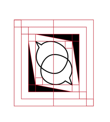
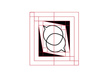
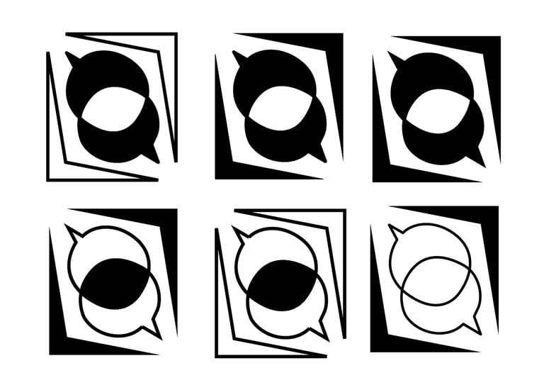
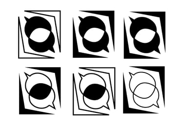
I also explored different ways to colour the shapes within the logo, exploring ways to also bring out the venn-diagram-like essence of the overlapping speech bubbles.
Finally, I incorporated texture into the logo to mimic an ink stamp, as well as add an organic and gritty feel to the logo. Below are the two final drafts presented to the client.
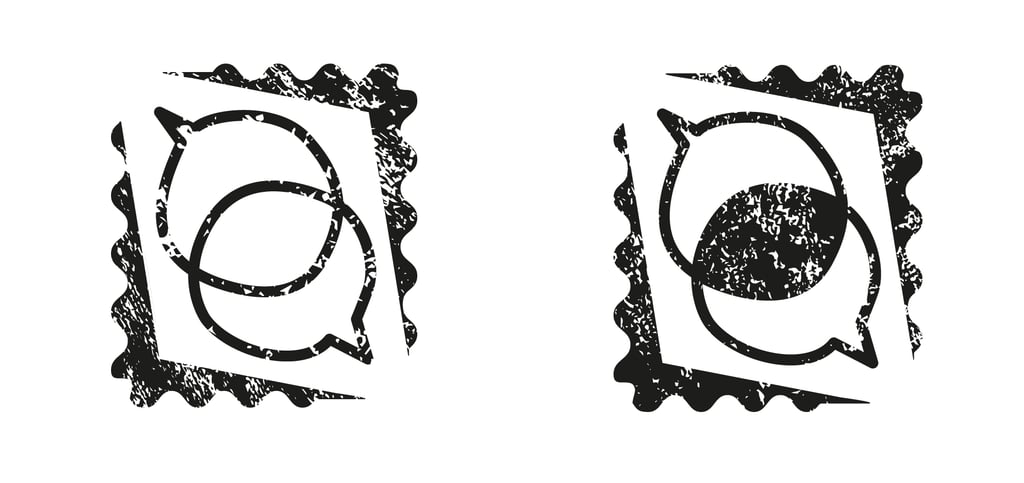
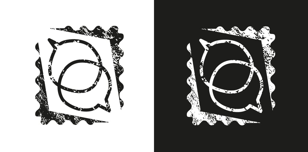
Final logo versions chosen by the client.
be/longing Logo Design
© Michaela Ruth Gallardo 2021
Logo in use on the be/longing website.

Logo in use on the be/longing Instagram page.


